
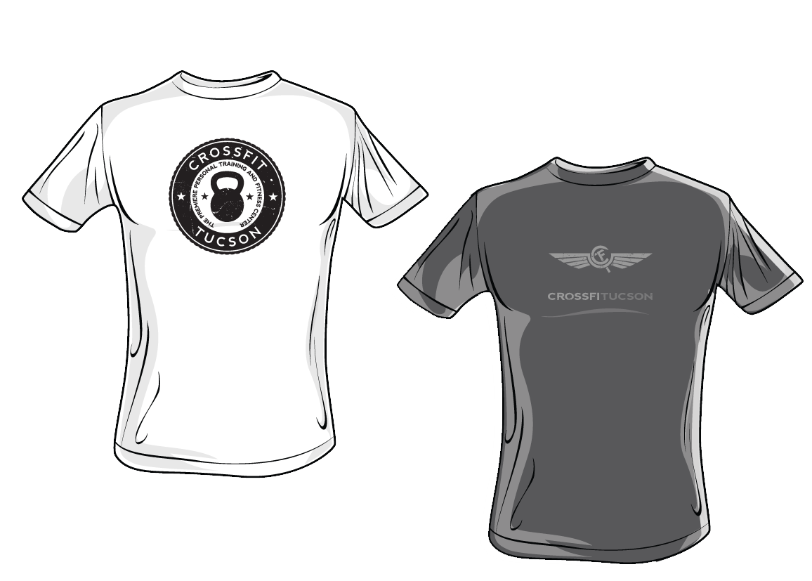
Gyms need t-shirts, so I have made a few for CFT. They tend to favor the grunge/distressed/retro look, so I have put together 2 pieces so far that have made it to shirts.
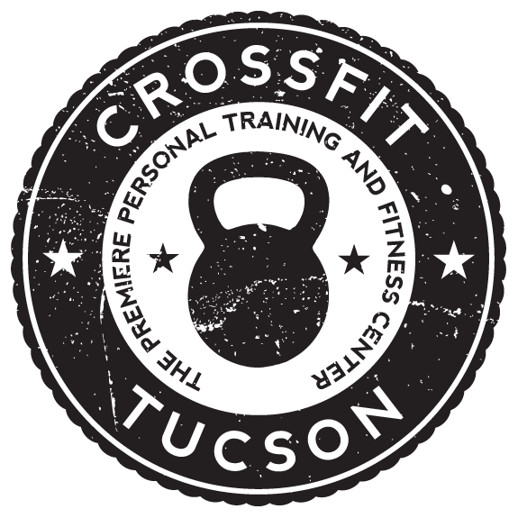
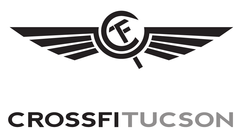
The circle piece features a kettlebell, which is a piece of equipment that they use often at the gym. The winged piece is a tribute to the old Aeroflot airlines logo. The owner wanted a piece with wings and also a merged combination of the "CFT" letters. This was the result, and it shares some of the components from that logo. They knew it, and I don't take credit for it as a unique design per se because of that.
You can view full versions of the circle logo here and the wings here.
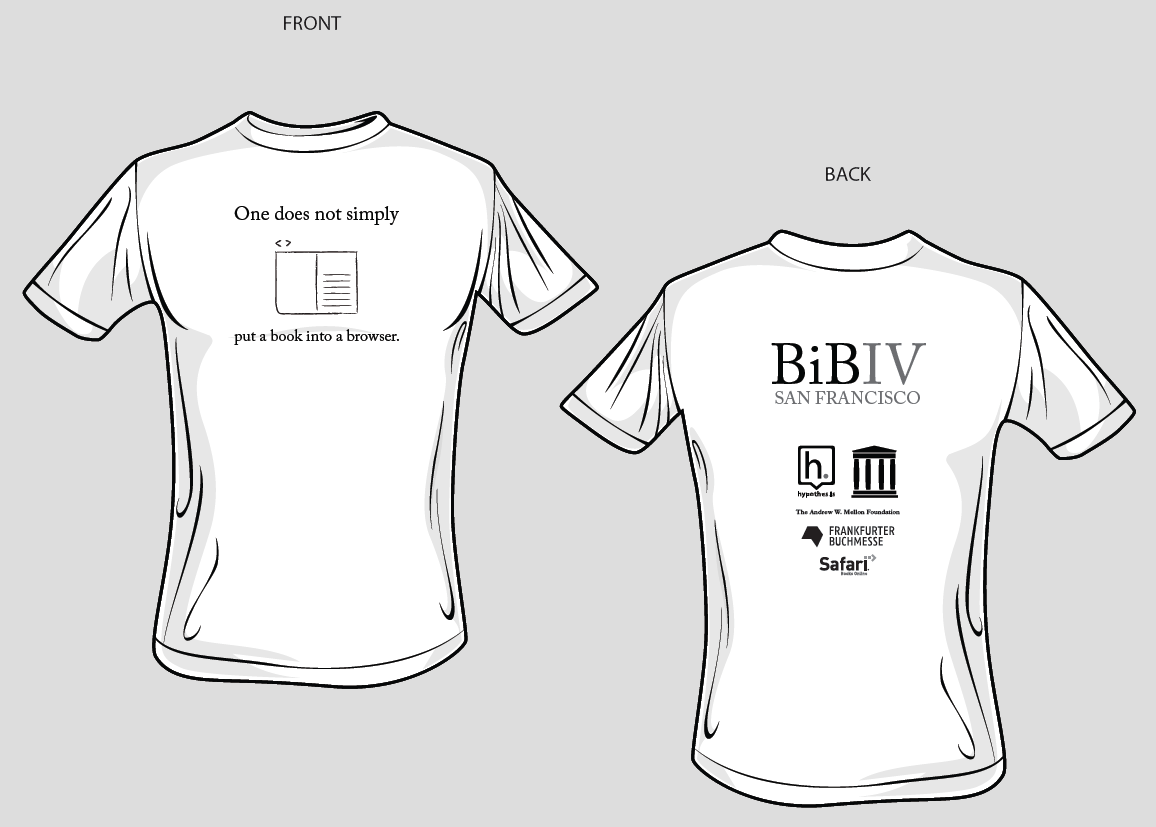
This shirt is more about the story than the shirt itself. Books in Browsers is a small summit for internet publishing companies, focusing on developers and designers who are building and launching tools for online books.
More to the point, they are understandably less focused on their brand than they are the work. Because of that, they have had some pretty dull conference shirts in the past, and I was asked to come up with something fun.
This was an idea I had to play on a famous line/meme, but also make a statement about their work. The tagline on the shirt was a hit, and it was actually a focus of a topic at the conference - specifically, does one just put a book in a browser, or does one not? This is pretty much at the core of what they focus on as a group, so it turned out nicely.

We never made this shirt, but it was my idea for a "you are here" map using a social network as the map. Trust me when I say that the engineers thought it was funny.
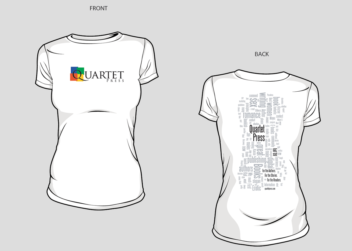
This was the t-shirt that was made for the launch of Quartet Press, whose first imprint was to be romance novel eBooks. The wordle on the back was intentionally given an hourglass shape, and it contained all the words related to the imprint and the company. I was always pretty proud of this shirt.

Every startup needs an arrogant t-shirt that proclaims their imminent success, and Cataphora was no different. The slogan "get us before they get you" wasn't mine, but I always thought it was a very good one. The reference back to it here was my tribute to it 3 years after it was coined.
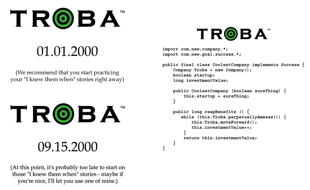
See the previous slide with regards to every startup needing an arrogant t-shirt. I think these 3 fit the bill quite nicely, but I still like my little snippet of Java code on this one.